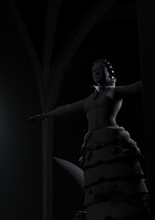
Trying to set up the lighting. 80 Focal Length used here. Thoughts? I really need to get her rigged and skinned tomorrow if possible, it's hard to make choices when she's stuck in such a rigid TPose.
I also have to thank James Garner, flaged up a few minor tweaks with my head model. Cheers buddy, I'll make those changes!


3 comments:
Recommend doing the posing and final textures before getting to setting the lighting and camera-shot. Planning and testing is obviously good but much easier getting the correct lighting, focal-lengths and angles once you have you're actual object in it's final state. Anyway, currently it looks too dark and the light is too white. Your head and textures is coming along nicely, though!
i dont know if this will mean anything but if you light her from lower down and in front the shadows cast will become more eerie, for example when you hold a torch below your chin, the lighting becomes more sinister. Things lit from behind tend to be ''good'' such as angels, things lit from below are more evil, sort of 'rising from below'... maybe you could apply this in some way??
Let's be honest, my lighting skills are rather undeveloped. Up until now, everythings been outdoor lighting which is a lot easier. I'm having to use 'real logic' to try and light it. She's in a dark, abandoned building, her only light source are lanterns up on the wall, they won't be pumping out much light. So lights from below are not an option with that. But I have spoken to Alan, and I decided that I will set up all of the 'scene lighting' and then at the end I'll be throwing in a light directly from the camera, which will almost be the victim with a lamp. This should pump some crazy shadows into there hopefully.
Post a Comment